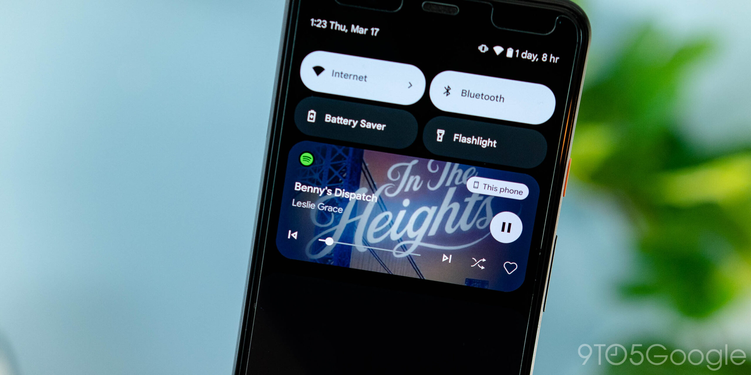
Android 13’s most obvious UI change is a redesign of the lockscreen and notification shade media player. However, not all music, podcasts, and audio apps have been updated to support them yet, and here’s our running list of what controls have been modernized.Original 8/18: The Android 13 media controls start with a new size that’s taller than what was on Android 12. (There’s a compact version, but only in landscape mode.) This allows for a larger cover art preview, though it’s a rectangular crop instead of showing the complete square artwork, like before.
The responsible app’s icon appears in the top-left corner, while the device output switcher remains opposite it. Song/podcast name and artist appear next in the lines below.On apps that have been optimized (or target) Android 13, the play/pause button (which morphs from circle to rounded square, and vice versa, on tap) appears at the right edge. It’s a delightful touch that’s followed by the absolutely whimsical progress bar that squiggles to note what you’ve already listened to.
Apps that aren’t updated for Android 13 still have the squiggling, but the bottom row is very packed because every button is located on a single line. The progress bar is at the far left with up to five actions appearing. Newer applications flank that line with next/back or forward/rewind, while remaining actions are shown at the right.
As of Android 13’s launch this week, very few big apps have been updated, but there are a handful of first-party clients where you can experience the new player.
Optimized for Android 13:
Google Podcasts: Part of the Google app
Chrome: When playing media from the web
YouTube Music
YouTube: Now in stable

